Thanks to a recent shift away from big box stores and corporate shopping, small retail stores are having their heyday.
To continue competing with ecommerce powerhouses like Amazon, however, small retail stores need to do everything they can to attract customers and close sales.
If you have a small storefront and you’re struggling to strategize shelf displays and maximize space, these tips can help.
Flexible Shelving
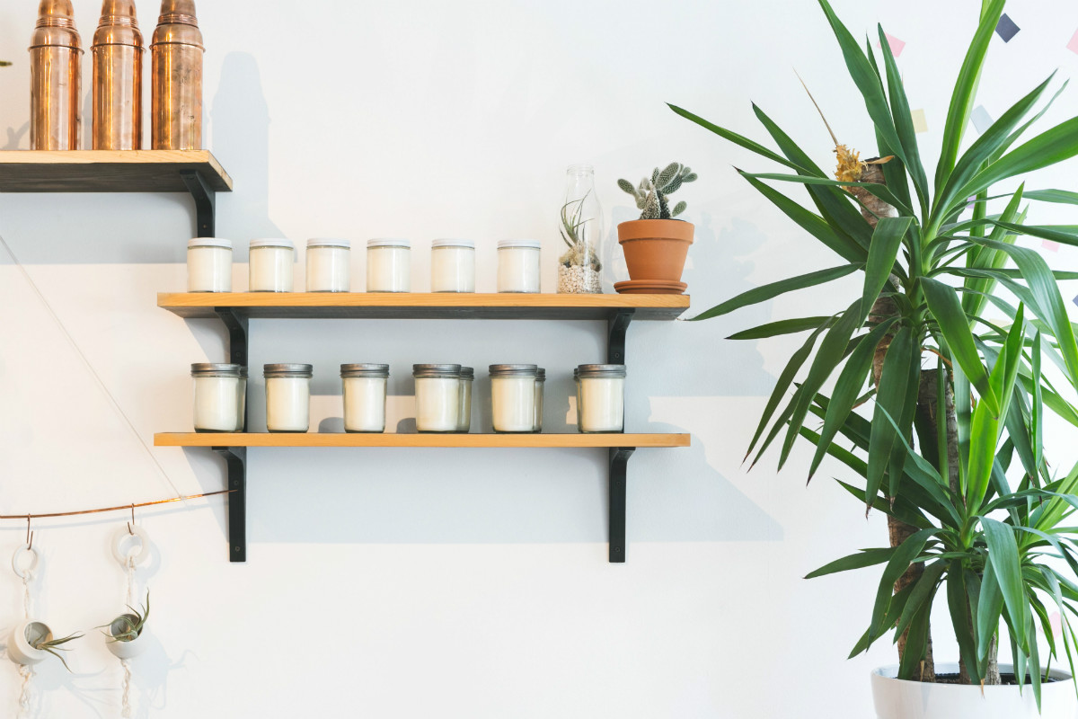
Adding flexible shelving to your store display is a great way to keep things interesting and make a space feel larger.
As Storefront’s
Pauline Warlet points out, slatwall panels make it easy to mount and detach brackets, which can support multiple shelving types. She also says that this type of panel works well in narrow retail spaces or storefronts because they have a sleek and minimal look that maximizes a sense of space.
Amelie Lawrence at
Founders’ Guide points to two more important benefits of slatwall shelving:
- These panels are designed to be extremely flexible, which means that they can be changed to accommodate different displays and themes.
- Slatwall shelving comes in many different finishes, shapes, sizes and styles. This makes it easy to customize so you can create a memorable retail space that reflects your brand.
In fact, business author and speaker
Mike Michalowicz believes that shelving plays a major role in a store’s overall atmosphere. While bare, stripped-down shelves evoke the budget-friendly feeling of a department store, he says, strategically filled shelves overflowing with colors and patterns create a more high-end, boutique vibe.

Test Merchandising Assortments
Another benefit of flexible shelving and displays is they can help small stores experiment with the ideal merchandising assortment.
DocActiv’s
Darren Gilbert explains how assortment planning helps companies select and display products in a way that maximizes profits in a given time period. This is how small stores can compete with big box stores, whose assortment strategies are often already fine-tuned. Instead of locking in a strategy that doesn’t work later on, flexible shelving makes it easier for small stores to test out different product assortments and see which shelving solutions and product arrangements drive the most profit.
Flexibility in retail assortment also makes it easier for small stores to combat the paradox of choice — when too many choices overwhelm and confuse a buyer to prevent them from purchasing.
The team at retail software company
Jesta I.S. uses Best Buy to illustrate this point. Here, a wide selection of electronics and appliances might actually lead to an overwhelming amount of confusion that prevents people from making a purchase.
Alternatively, business reporter
Rieva Lesonsky says customers respond well to smaller, curated collections. Showcasing a small selection of hand-picked, high-quality products are more important than ever in retail. With flexible shelving that can be changed often, small stores can be more strategic about what products are displayed when, thereby creating a more relaxing and inviting experience that doesn’t overwhelm.
To see first-hand how modern shops are displaying smaller, better-curated collections, consider some of the examples
Genevieve Fish points to at My Domaine. Whether it’s hanging triangular shelves that draw the eye upward, or a window filled with products that tell a different story every month, other shops are a great place to find store inspiration.
Lighting Effects
Lighting is an important way to enhance the sense of space in a small storefront.
As writer
Jane Porter points out, using a variety of lights can add flair and variety. Moreover, having a combination of track lights, lamps, sconces and picture lights can help illuminate your space and switch things. This ensures that your displays stay interesting and catch people’s eyes, even when you’re working with little floor space.
It’s also important to keep dark corners well-lit, which will ensure that all parts of your store feel bright and inviting.
FLARE associate editor
Lauren Ufford agrees that a well-lit store is key to exuding an inviting shopping ambiance. She also explains that there are multiple types of retail lighting, all of which can play a role in your store’s perceived sense of space:
- Ambient lighting sets the mood for the shop.
- Accent lighting helps highlight your products.
- High-activity lighting helps keep tight, dark corners illuminated.

Colors and Patterns
Similarly, painting one wall of your storefront a bright color can add depth and character. An accent wall can be adorned with a bright color that echoes your brand and makes a wall pop. Printed fabric and patterned wallpaper can also make a space feel larger, according to Fit Small Business writer
Anna Dizon.
When considering an accent wall, you’ll want to choose something that is much stronger and bolder than the other colors of the space. This strategy can also create a focal point in the storefront, which may make it easier to style the rest of the shelving and display into a cohesive look, Bustle’s
Julia Bowyer writes.
Choosing a removable wall skin can make it easy to switch up the look and feel of your retail space, which will keep recurring customers intrigued and visually stimulated.
When choosing wall colors and skins, you might consider how a mirror will amplify the space-enhancing effects.
Ronique Gibson, owner of the home lifestyle website Stagetecture, explains that mirrors can be strategically placed at the end of a hallway or opposite a window to enhance the sense of space in a room.
Standing mirrors are a great way to accommodate flexible wall designs because they can be moved around easily. Plus, they will allow you to experiment with different store layouts.
Consider a Pop-Up Shop For Immediate Space Needs
One workaround for retailers with small spaces is to get out of that space entirely. We’ve talked about this before, particularly the notion of cultivating a
pop-up mindset.
Sometimes, it simply makes more sense to go where your customers are rather than vice versa. Perhaps there’s a nearby event such as a festival where your target audience will gather en masse. This is the perfect time to leverage the power of agile retail and set up a pop-up shop on location.
Now, let’s take this thought a step further. Retail design company Barrows Global (whom we’ve partnered with), has just launched a new initiative called the
Connected Pop-Up, a line specifically for retailers who want to get more out of their pop-ups. The modular products feature traffic-tracking sensors, facial recognition technology and whole touchscreen environments to engage shoppers and learn more about what they’re interested in.
Versatile Furniture
As retail consultant
Dr. Rupal Shah Agarwal says, it’s a good idea to ensure the space you do have is filled with strategic furniture. Instead of wasting space on uncomfortable furniture like couches and permanent seating or tables, consider the effects of versaille seating.
Using plush chairs and arranging them in corners can invite people to come and have a sit, especially in retail spaces with dressing rooms. Moreover, your seating arrangements can be moved and adapted to accommodate different moods and themes in your space. Opting for smaller pieces of furniture can also create the illusion of a larger space.
Designer
Kathy Kuo says that for home interiors, clutter-free surfaces and smaller coffee tables help draw the eye towards open space in a room, making it feel bigger. This same effect can be achieved in a retail space by opting for smaller chairs, tables and shelves that are floated out from the wall slightly.
Furniture can also be used as a visual effect to create more sense of space in a small shop. Like When the design agency
Kennedy Woods was designing a small tea kiosk, for example, they were struggling to find enough space to fit the right amount of seating arrangements comfortably.
Fortunately, they opted for a long, dual-level counter across the shop’s width along with a long bench in the front. Using one table instead of multiple tables simplified the seating arrangement in the space while exaggerating the room’s length. This same strategy could be echoed with a retail display table or clothing rack.
Images by: Matthew Henry, Sarah Pflug, Burst
