Most people don’t have to think twice about using an elevator or walking down the hall at lunchtime. But for people with disabilities, these daily tasks can become complicated and frustrating due to poorly designed spaces.
Accessible design considerations can help eliminate these challenges while attracting a more diverse group of people to your venue or office. This introduction to building accessibility will help you design spaces that are welcoming to people of all abilities.
Understanding Accessibility Needs
Everyone should be able to gain access to buildings and use the facilities there, regardless of their level of disability. With this in mind, it is key to include basic features such as accessible restrooms, ample handrails and adjustable workstations. Industry knowledge resource Designing Buildings Wiki — helpful for designers seeking more knowledge on accessibility — adds that accessible spaces must also consider how lighting can affect a person’s experience in your building.
These are all aspects of navigation, which the disability and lifestyle blog Life of a Blind Girl notes as fundamental in accessible design. Moreover, designers should keep in mind how they can create spaces that facilitate orientation.
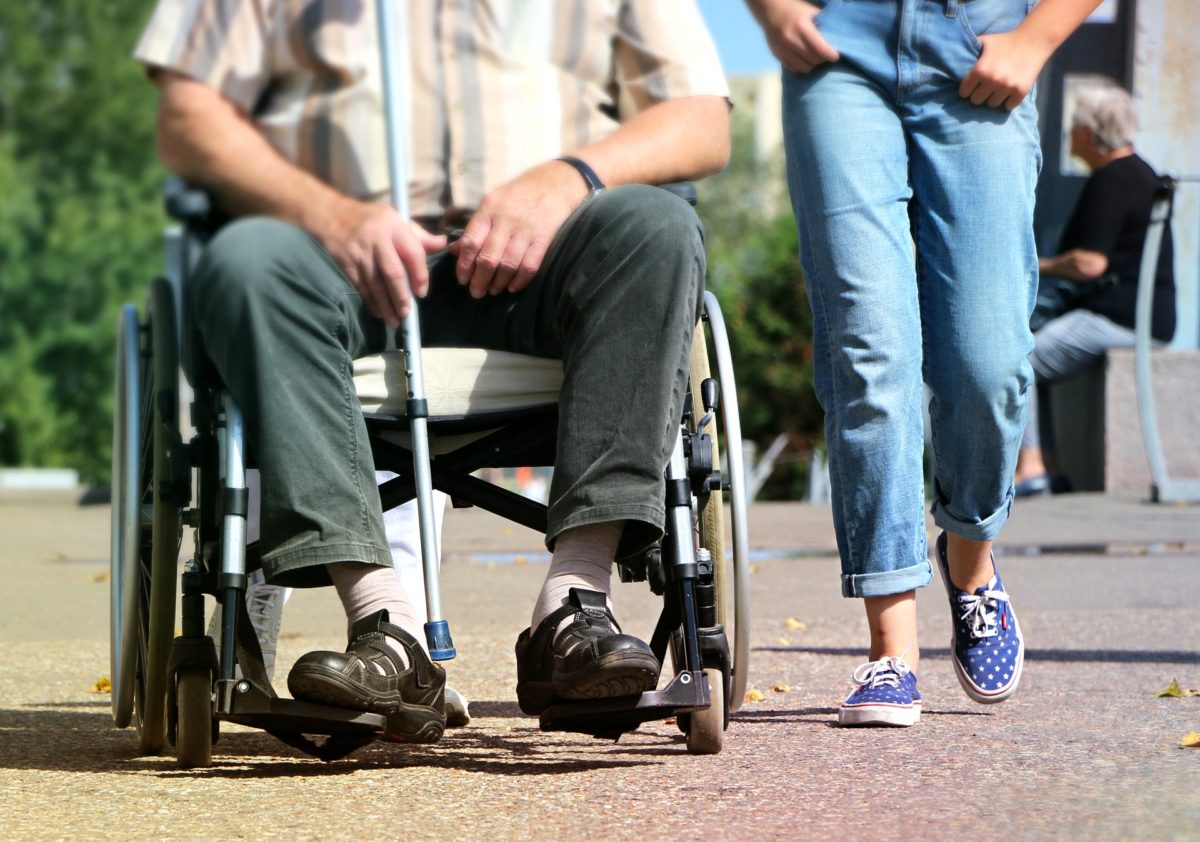
Think: would someone in a wheelchair be able to move around this floor on their own? Asking such questions will better promote the independence of disabled individuals in your building.
With existing buildings — especially older office and conference venues — accessibility updates are key. Senior building code consultant Leah Riley explains that many facilities managers neglect to update older buildings to meet current ADA regulations. Adding curb cuts to sidewalks and entrances, widening doors and attaching accessible hardware to those doors, eliminating high pile carpet and arranging office furniture, are all examples of how barriers can be removed from older buildings and their walkways.
Accessible Restrooms
Restroom design is fundamental to venue accessibility, but it’s often overlooked. According to meeting design consultant Joan Eisenstodt, restrooms with wheelchair accessible signage often aren’t any more accessible than ordinary stalls.
Specifically, making a bathroom stall only slightly larger isn’t a solution to accessibility. This is because there needs to be ample space for a wheelchair to turn around, Eisenstodt adds, along with a number of other hardware considerations.
Accessible restrooms should also include hoists and changing benches, according to UK evaluation company DisabledGo. It’s important to keep in mind that some people can’t use ordinary toilets, especially those in standard-sized stalls. Changing Places, which creates toilets specifically for use by individuals in this situation, explains that toilets should accommodate individuals with multiple sclerosis, cerebral palsy and other motor neuron diseases, as well as older people with reduced mobility.

Additionally, caregiver support specialist company Elizz points out that bathrooms should include grab bars and sinks that allow wheelchair access. The locations of bathrooms should also be taken into consideration, ensuring they are easy to find and get into for those with mobility challenges.
Dee McCurry at the conference management company Ex Ordo points out that having bathrooms close by is important for people with invisible impairments or conditions that make walking difficult, such as Crohn’s disease.
Venue and Event Accessibility
To explore how music venues can be made more accessible, journalist Sophie Weiner interviews a number of accessibility advocates and experts in her article at Hopes & Fears. One piece of advice gleaned is that concert and conference venues can consider installing viewing platforms to accommodate disabled individuals in large crowds.
In addition to helping visually impaired people see the performance, viewing platforms can help those with hearing impairments orient themselves and stay focused on the show or speaker.
Communicating your venue’s accessibility features can also create more positive experiences for impaired people. BBC Newsbeat music reporter Steve Holden says more festivals and events are creating dedicated website pages with accessibility information. As a venue, being clear about accomodations can help conferences, festivals and other events choose your space as a host.
Office Accessibility
Creating an office where people feel comfortable and cared for is key to promoting productivity. That’s why it’s so important to design an office that emphasizes universal design, according to workplace consultant Elaine Mullarkey.
A universal design concept ensures that staff and team members don’t have to ask for special treatments and design changes for their needs to be met. Instead, universal design anticipates potential challenges and eliminates them.
Director of Accessible Technology Services at the University of Washington, Sheryl Burgstahler, Ph.D., puts it like this: “Universal design means that rather than designing your facility and services for the average user, you design them for people with a broad range of abilities, ages, reading levels, learning styles, languages, cultures, and other characteristics.”

Equipping your office with flexible furniture and technology is another way to adhere to universal design principles. Height adjustable desks, accessible plug sockets and adjustable monitor arms all help accommodate people of varying needs, Barry Chignell at HR software company CIPHR writes.
Similarly, underfloor power and cable management make it easier to navigate the space, reducing tripping hazards and clearing floor space for wheelchairs.
In offices with multiple floors, multi-level mobility is a key concern. Ivan Widjaya, founder of entrepreneurship blog Noobpreneur.com, says it’s important to consider how all kinds of people will move between different office levels. Climbing a few flights of stairs might be difficult even for an able bodied person who’s older or injured temporarily.
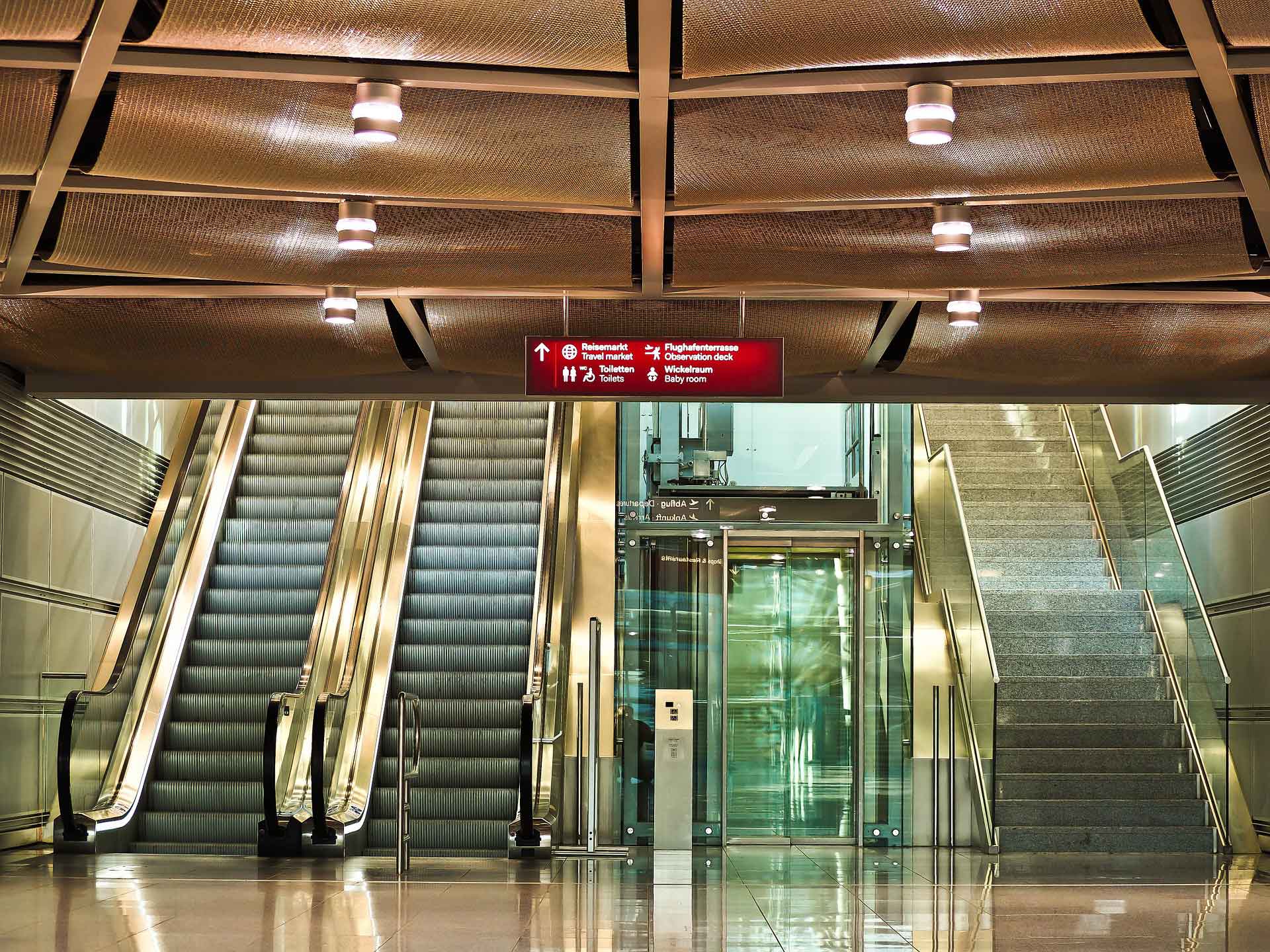
Therefore, it’s essential to have an elevator that’s easy to find, enter and exit — along with the option of stairs with well-marked signage and railings.
Accessible Spaces Leading the Way
Looking at offices and venues that succeed at accessibility can inspire a more innovative approach to your designs. Social affairs journalist Saba Salman shows how Singapore is leading the way in making buildings and public spaces more accessible.
In one 40-story office block named CapitaGreen, for example, a number of innovative accessibility design features exist. These elements include braille instructions, pictographs and tactile guidance throughout the building. Smaller details, such as elevator doors that stay open longer, also play a major role in making this office building more accessible.
Google is a company leading the way in accessible office design, Patrick Sisson at Curbed writes. Automatic door openers make it easier for wheelchair users to move through hallways, and textured, colorful floor mats enable visually-impaired team members to navigate the open office plan.
The office also includes an innovative signage system, where braille wayfinding corresponds to a responsive tactile map with both auditory and sensory cues. This technology in particular is elevating what it means to promote independence among people who are visually impaired or hard of hearing.
Another innovation in accessibility comes from Neatebox founder and disability equality advocate Gavin Neate. Neate’s invention, an app called Welcome, assists disabled people in navigating cities on their own. Local venues partner with Neate, providing information about public spaces that are accessible and navigable for impaired individuals.
Users can browse the app to find hotels, airports, galleries, office buildings and other venues near them. Partnering with an app like Welcome is a simple way that venues can make their spaces more accessible and inviting.
Images by: Klimkin, Michael Gaida, Csaba Nagy
