Here’s how to create branded spaces at your next event through carefully curated wall design, social media sharing and customer interaction.
 Whether it’s a multi-act concert or an industry-wide trade show, your brand’s presence at events matters. Having a well-branded event presence helps your company look professional while solidifying your brand in customers’ minds.
However, there’s no denying that its difficult to achieve a balance between a memorable branded space and one that feels too promotional.
Here’s how to use interactive decor, branded walls and creative brand elements to stand out at the next event.

Interactive Decor
You’ve likely heard about technology playing an increasing role in making events more interactive, but decor can also play a role in making events both interesting and experiential. For example, Kate Patay of Patay Consulting explains that events are moving toward more networking-focused environments that prioritize interaction. On a simple level, colorful wallpaper is being used to create separate lounge spaces that invite strangers to sit down and talk. Interactive food and drink stations are also becoming a popular aspect of interactive event spaces. Another idea for promoting interaction comes from event manager and writer Kelli White. She adds that creative seating and standing arrangements help get guests’ attention, enticing them to visit your booth. And once they’ve stopped by, they’re more likely to spend time in an interesting space they enjoy. One example of a creative seating arrangement and event presence in action comes from Buddabag, a creator of high-end memory foam bean chairs. Creative branding solutions firm Vision Branding adorned the brand’s event booth with an inviting space that welcomed people to come sit down and experience the bag. The point of this design was to communicate the soft, stress-free experience created by sitting on a Buddabag. By adorning the walls a cement-like pattern, and adding large white balloons to the ceiling, Vision Branding effectively created a high-contrast space that played with materials and fibers. This resulted in increased interaction with the product and improved sales on the floor.
Branded Walls
Plain white walls provide an excellent opportunity for branding an event space. Specifically, walls can be adorned with signage, logos and other imagery that creatively display your event offering and make the experience more memorable. In a project for a local energy center, Detroit-based branding and environmental design company Ideation used two-tone colors to break up the starkness of plain gray walls. Then, these two-toned colors were layered with subtle graphics and imagery that make the space feel branded and interesting without going overboard. You could also use colors to spruce up walls and separate spaces while reinforcing your brand. Eventbrite writer Bel Booker notes that colors help set the mood and tone of your event. While hot pink and orange can promote creativity, greens and blues might promote focus and relaxation. Using your brand colors is also a smart idea, but it’s important to heed Booker’s advice and consider how these colors might make people feel.Step and Repeat Media Walls
Media walls, also called step and repeat walls, are essentially branded backdrops for photos. Often seen at awards shows and galas, these photo backdrops are usually adorned with a single pattern or a series of sponsor and event logos. For a more sophisticated approach to the traditional event wall, consider the original branding from The Event Boutique. For a popup lounge event hosted by a magazine, the event design and styling company created a colorful branded illustration that appeared throughout the event, including on a circular photo backdrop. This sign also featured multiple sponsor logos to reinforce all of the event’s partners in a clean, tasteful and consistent manner. Another idea for interesting step and repeat walls comes from floral and event designer B Floral. Because traditional logo walls might not entice people to share on social media, a more interesting pattern could encourage stronger engagement. B Floral uses one example of a previous event design to showcase what this might look like. Instead of repeating logos, the company sought a seasonal pineapple print adorned with real flowers and tropical plants. Instead of multiple simple logos, the pineapple print was adorned with one large, hot pink logo that was instantly instagram-worthy. Photography and imagery can also help your step and repeat wall stand out at an event. California-based event planning company The Firm leveraged photography in their design for the Wolverine LOGAN movie premiere. Specifically, black and white canvas printed photos from the lookbook were printed, framed and hung on the step and repeat wall. These images told the story of the series’ progression in an artistic and thoughtful way. Then, these images were balanced with gold and red walls and carpets to reinforce a classic movie premiere feeling.Social Media Walls
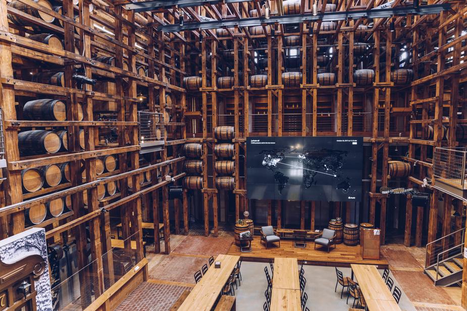
For a more modern approach to branded walls, you might consider a digital wall that features live social media streams. Brandon Rafalson at Bizzabo adds that you might also feature streams of certain hashtags or keywords to see who’s talking about the event in real time. This opens up the conversation and encourages attendees to tweet and share at the event to make it even more interactive. SocialWall is one company that makes it easy to aggregate live social media feeds and project them onto a viewable platform. For longer events, this tool also makes it easy to continue sharing social media feeds across multiple days. Plus, it will aggregate analytics from the entire event to help you analyze and understand the social influence of your event branding effort. If social media walls do become a part of your event design, you might also have social props handy. Boston-based design studio Art of the Event suggests creating props adorned with branded hashtags that guests can hold in photos. In addition to reinforcing your brand and theme, this creates a fun way for people to interact.