As a business owner of a brick-and-mortar retail store, you may be able to churn out detailed reports of your customer demographics and even use digital upselling tactics to convert a browser into a buyer. But if you are not paying attention to your store’s overall look and feel – a key factor in influencing purchasing decisions – you are missing out on an opportunity to boost your sales.
There are three basic areas you should address when considering changes to your existing store layout design: the front of the store, the layout and the “atmosphere.”
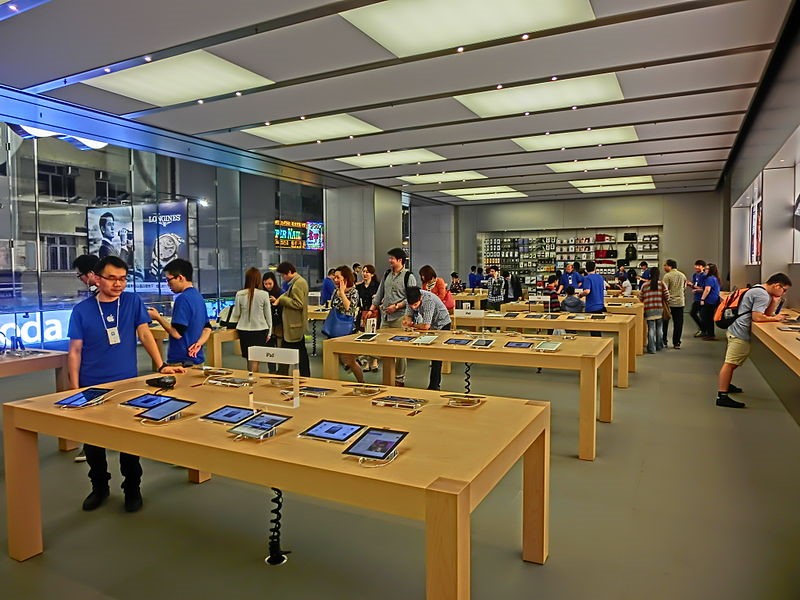
 Apple Store, CC image courtesy Mrodaikusek
First Impressions Count
Window displays can be instrumental in driving new customers into your store, especially if you are not a name brand. Remember, people are visual – putting a spotlight on your premium inventory in an eye-catching way can increase foot traffic. The advent of digital signage allows you to showcase your products with changing images and video, or even promote your latest sales.
The Lay of the Land
A study shows that when customers enter a store, they tend to move counter clockwise. This means that the prime spot for your highest profit-margin products should be just to the right of the door. It also suggests that consumers will shop longer in stores that have entrances on the right, versus center or left-side entryways.
Product placement can also influence shoppers’ walking patterns and encourage them to buy more. A classic example: if your store sells staples like milk and eggs, they should be placed in the back of the store. The customers must pass rows of other products to get to the essentials, encouraging them to stock up on their way to the rear.
By placing your most profitable goods at eye-level, you will increase your chances that the shopper will choose that item by an additional 35%! Also, unclutter your space and keep walkways wide to make customers feel comfortable and valued.
A great example of a less-is-more store design is the aforementioned Apple, where wide spaces and clean, simple design evoke an air of exclusivity and high value. A bad example? A story by Business Insider bemoans a disturbing trend toward retail disarray.
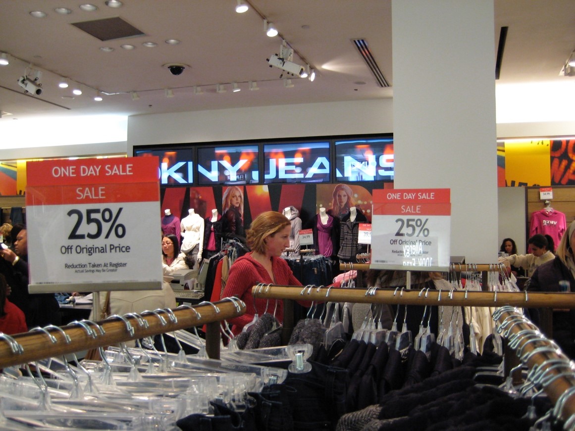
 Macy’s New York City. CC image courtesy Phil Whitehouse
The Ambiance Factor
From the smell of fresh-baked cinnamon buns to the feel of a cashmere sweater – every vertical can capitalize on tapping into shoppers’ senses to boost sales. Retail stores should deploy light, pleasant aromas around their stores, while restaurants can pump out the scents from the kitchen. Case in point: Panera Bread moved its baking time to daytime hours so customers could smell the bread all day long.
Touch is increasingly important for retail stores. For instance, Square Root showed that 65% of shoppers turn to stores for their holiday shopping so they can feel, touch, and see products before they purchase.
Don’t forget sound: create a soundtrack for your business your demographic can relate to, giving your brand an audio identity. Not only will it influence how your brand is perceived, but will also impact the time customers spend in your store and make lines go much faster.
See what Emagispace can do for your retail space interior design
Emagispace® allows you to design and build any type or size of retail store layout you want, with less labor, less cost, and using environmentally-friendly materials. Our patented, kit-based interlocking building system creates high-quality, solid walls, floor displays and backlit shelving. Contact us today to find out how we can help you achieve a smarter store layout design.