In the past, office environments have been focused solely on promoting productivity and profit, with employee comfort and morale distant considerations. With a growing shift towards the importance of holistic work environments coupled with corporate authenticity, more companies are prioritizing interior designs that send powerful messages to both visitors and employees.
In fact, many of today’s offices are drawing inspiration directly from the world of retail — where strong messaging and human connections are key. From brand logo walls to colorful interior design, here’s how retail design is inspiring the office of tomorrow.Strong, Authentic Brand Messaging
A well-designed retail space helps reinforce the missions and vision of the brand among customers, workplace designer Clayton Whitman at CallisonRTKL writes. Likewise, office environments inspired by strong messaging can help employees feel more inspired by the company mission. As Grafik principal and creative director Gregg Glaviano puts it: “Go big and embrace themes regarding “why” your organization exists, rather than bombarding employees with how you want them to act and feel.” Creating an office layout and using décor that incorporates a company’s purpose can leave employees feeling more inspired while attracting top-tier talent. Moreover, SMMA project manager Jonathan Merrin says that an office environment should reflect both brand and culture. This approach allows employees to identify more completely with the corporate values and to be successful in that environment. Another interesting way to think about the relationship between brand messaging and office space is that the biggest brands in the world sell lifestyles, not products. The look and feel of a store or workplace demonstrates this lifestyle. Designing an office space that reflects your company’s values allows employees to convincingly live and support those principles every day, San Diego Office Design founder Tamara Romeo adds. A well-designed office also shows your employees that you care about their well being, which can in turn boost overall morale and productivity. Architecture student Lana Hawkins at the Don’t Call Me Penny Interior Design blog notes the important role that office environments play in employee happiness, health and success.http://dontcallmepenny.com.au/good-office-design/
Brand Themes
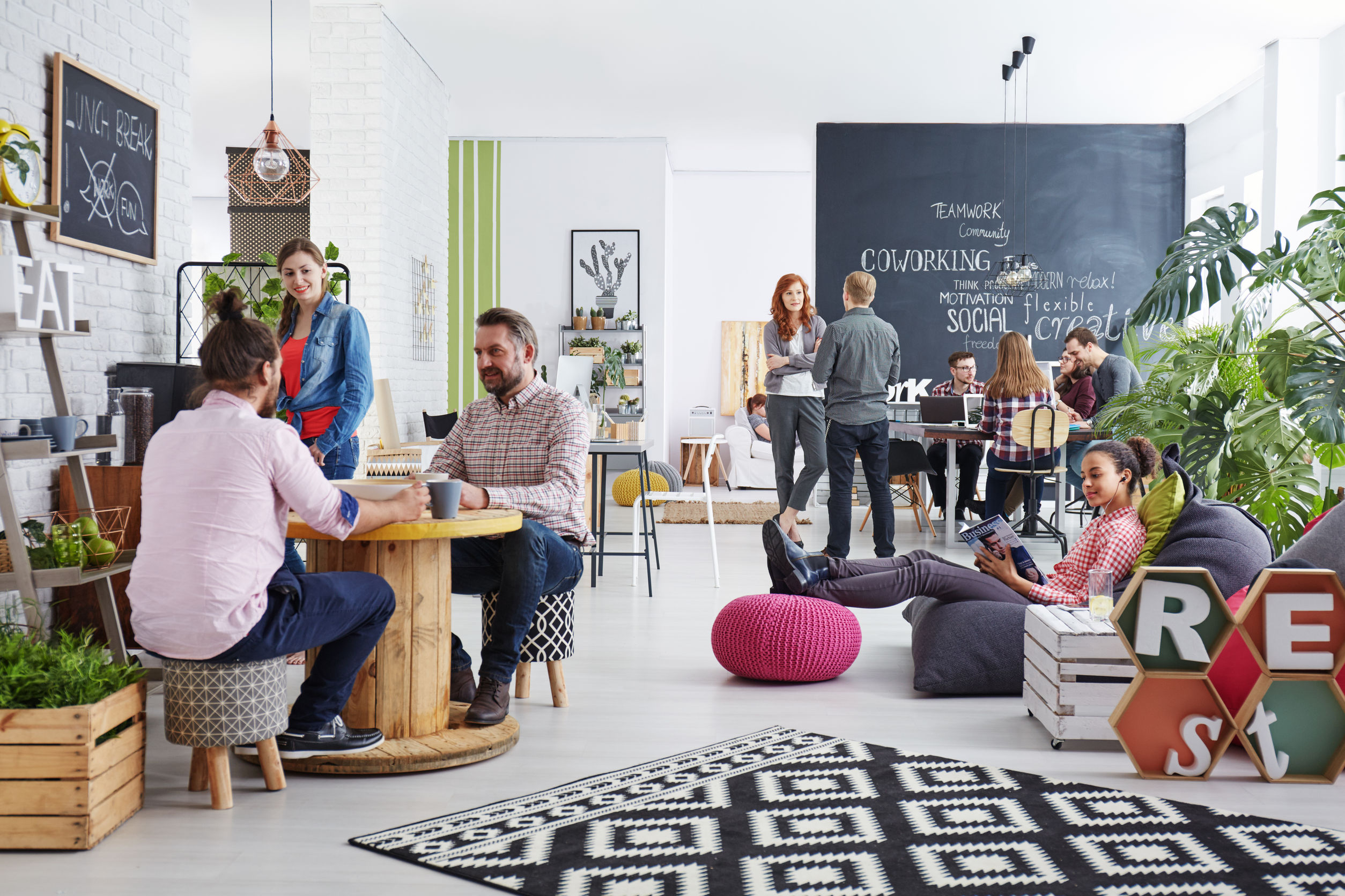
To create a store theme, many retailers start by considering the flow of the space itself. How will customers walk through the space, and what will they see first? To draw from this strategy, consider the path each employee takes as they walk to their desk or office. What can you put in their path that can reinforce the corporate vision and purpose? This process is called natural journey mapping, Gabrielle Dalvet at office scheduling platform Robin writes. She suggests that when you walk this natural path with an eye to design, look for inspiring spaces and high volume areas. These can help dictate where brand messaging would be most impactful. Having a variety of options for workspaces and activities can also help keep employees inspired as they move about the office. The furniture itself matters: Examples include massage chairs, ping pong tables and lounge chairs in front of white boards, Jordan Burrell at EnVeritas Group writes. In the same way that stores create multiple displays for a variety of products, these in-office choices create areas of freedom and creativity for employees. And companies shouldn’t be afraid to include bold elements into office design, Ditto Music founder and CEO Lee Parsons says. This is how many retail stores draw people in from the street, whether it’s a strong scent, loud music or other sensory-driven experience. Symbolic items and décor pieces can also help represent your brand. A consulting company, for example, might benefit from having a chess board as a feature piece in the office, Adrian Brossard at JP Office Workstations writes.Creative Welcome Areas
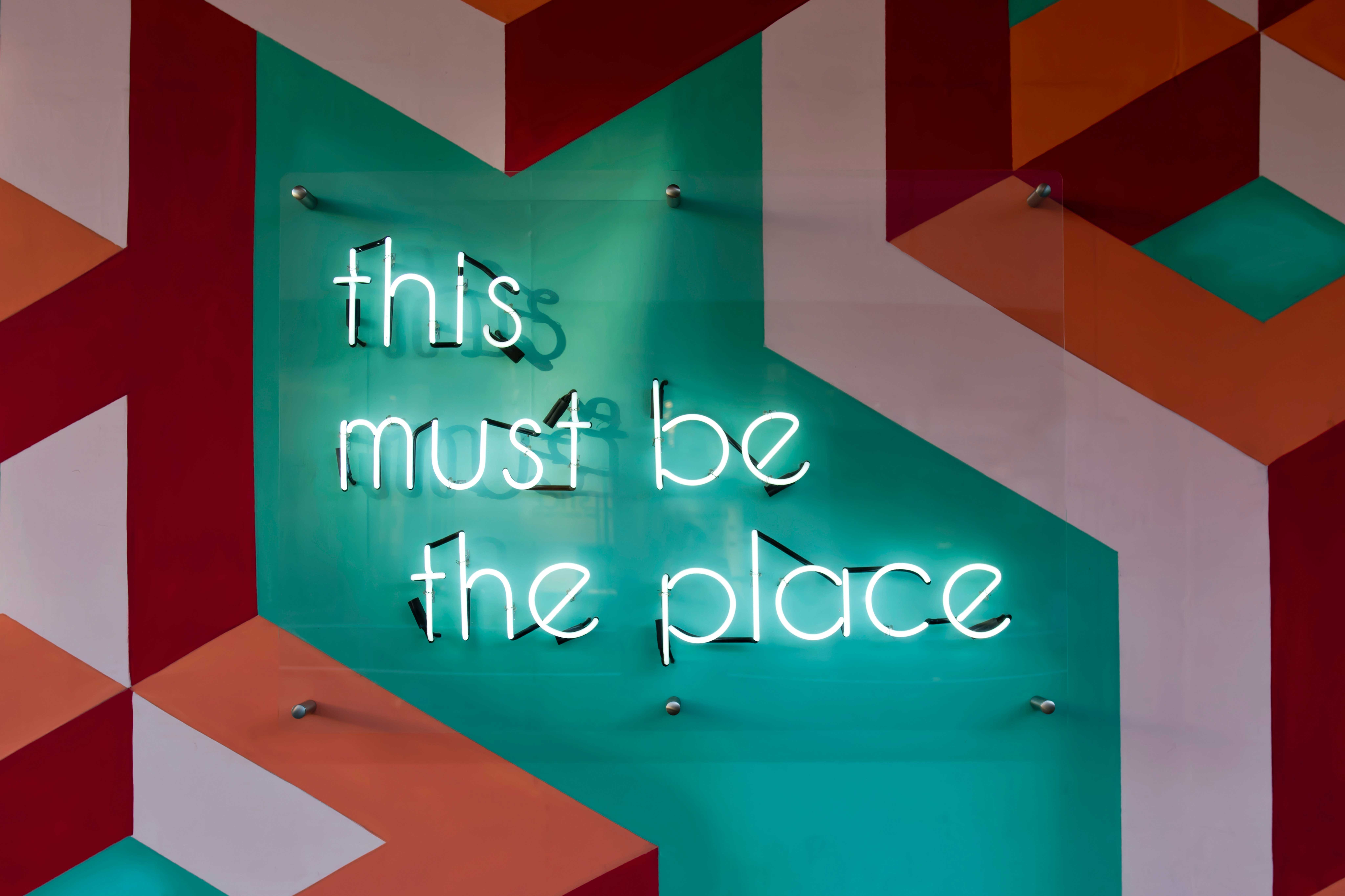
How a brand greets both visitors and employees can say a lot about what the company values, which in turn can inform how people feel when they’re in the space. Another idea for incorporating brand values into a space is to add inspirational quotes, imagery and messaging that sets a positive and focused tone for the day. Zach Hochstadt, founding partner of branding firm Mission Minded, points to a healthcare provider that welcomes everyone with a vibrant, inspiring message as soon as they step out of the elevator. Sprucing up the wall behind the reception desk is another trick borrowed from the retail industry. At the Grand Rapids visitor center in Michigan, a photo wall featuring employee photos creates a strong and authentic connection to the people behind the brand, Natalia Connelly at workplace design firm Custer, explains. Highlighting employees and team members is a great way to ensure that your interior strategies move beyond simple design and incorporate value and purpose. This is because, as the retail industry has known for some time, it helps employees feel recognized and appreciated. And employees who receive a form of recognition are more likely to feel happy happy with their jobs and cared for, designer Michael Moulton at the productivity platform Teem writes.
